
Android Studio Basics: A Quick Guide
Read Time:3 Minute, 44 Second
Content
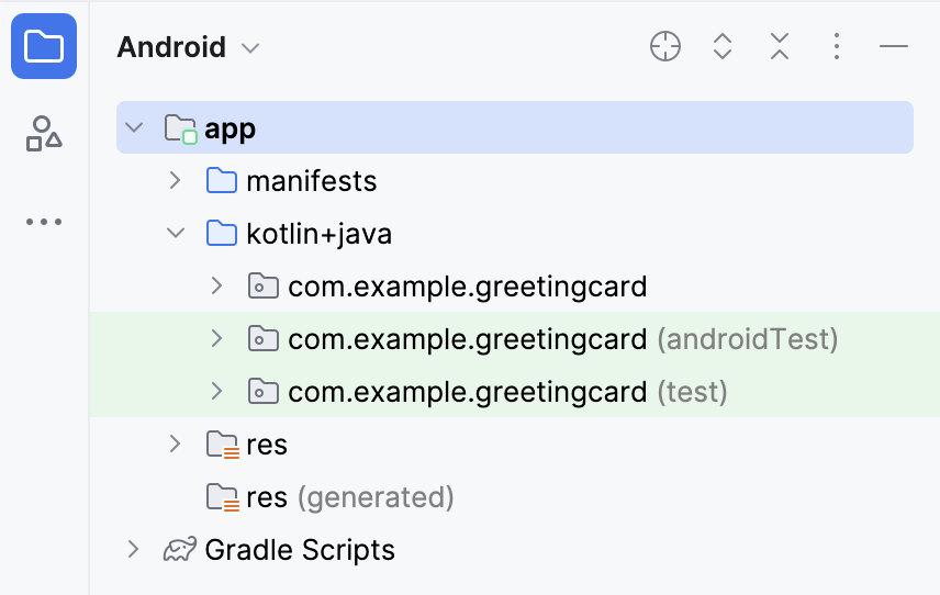
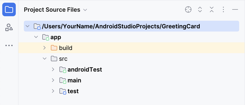
Project View
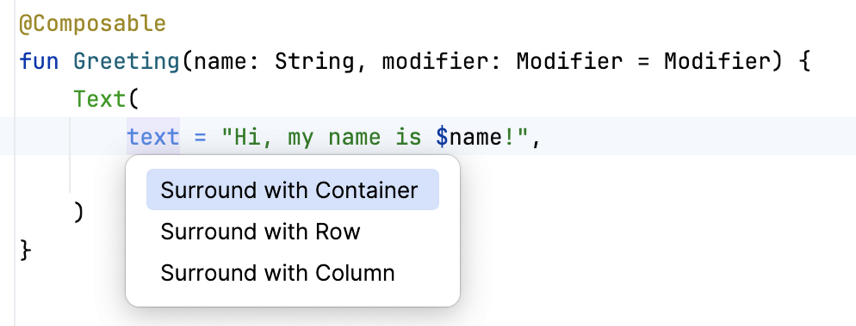
Surround
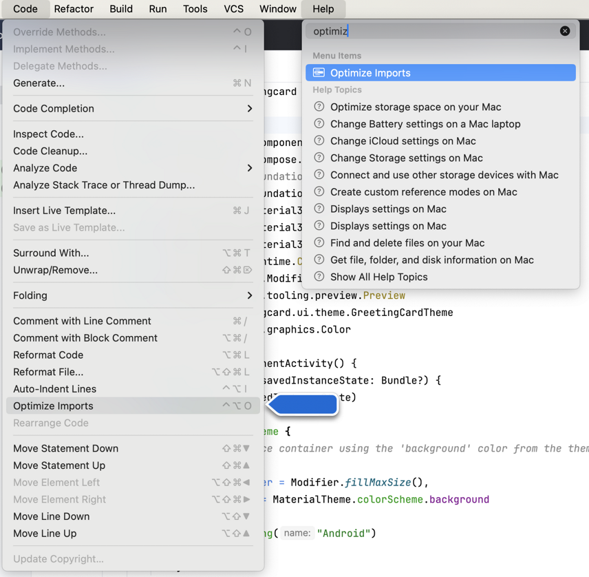
Optimize Imports
com.example.greetingcard
package com.example.greetingcard
import android.os.Bundle
import androidx.activity.ComponentActivity
import androidx.activity.compose.setContent
import androidx.compose.foundation.layout.fillMaxSize
import androidx.compose.foundation.layout.padding
import androidx.compose.material3.MaterialTheme
import androidx.compose.material3.Surface
import androidx.compose.material3.Text
import androidx.compose.runtime.Composable
import androidx.compose.ui.Modifier
import androidx.compose.ui.graphics.Color
import androidx.compose.ui.tooling.preview.Preview
import androidx.compose.ui.unit.dp
import com.example.greetingcard.ui.theme.GreetingCardTheme
class MainActivity : ComponentActivity() {
override fun onCreate(savedInstanceState: Bundle?) { // onCreate() - main() is for Kotlin.
super.onCreate(savedInstanceState)
setContent { // setContent() use Jetpack Compose to generate the UI.
GreetingCardTheme {
Surface( // Surface() container - background color & border.
modifier = Modifier.fillMaxSize(),
color = MaterialTheme.colorScheme.background
) {
Greeting("Android")
}
}
}
}
}
@Composable // Add the @Composable annotation before the function.
fun Greeting(name: String, modifier: Modifier = Modifier) { // @Composable function names are capitalized.
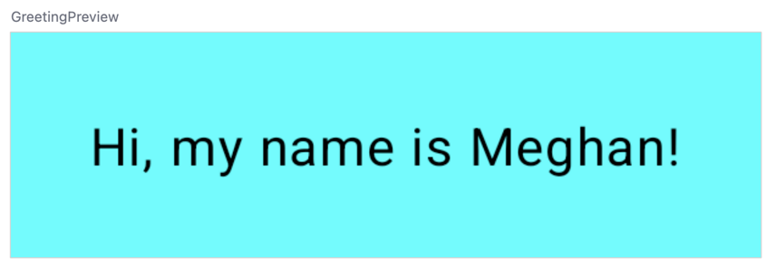
Surface(color = Color.Cyan) {
Text(
text = "Hi, my name is $name!",
modifier = modifier.padding(24.dp)
)
}
}
@Preview(showBackground = true) // @Preview - Show in Design View.
@Composable
fun GreetingPreview() {
GreetingCardTheme {
Greeting("Meghan")
}
}
Surface()
Parameters of Surface() (Material 3)
- Modifier → layout / interaction
- Shape → rounded, circle, custom
- Border
- Color → background color
- contentColorFor → text/icon color inside
- tonalElevation: Dp = 0.dp → overlay tint for tonal layers
- shadowElevation: Dp = 0.dp → drop shadow depth
@Composable

fun MySurface(

    modifier: Modifier = Modifier,

    color: Color = MaterialTheme.colorScheme.surface,

    border: BorderStroke? = null,

    content: @Composable () -> Unit

) {

    Surface(

        modifier = modifier,

        color = color,

        border = border,

        shape = RoundedCornerShape(12.dp),

        shadowElevation = 4.dp

    ) {

        content()

    }

}
Modifier
Best practice Composable accept a Modifier parameter
@Composable

fun Greeting(name: String, modifier: Modifier = Modifier) {

    Surface(color = Color.Cyan) {

        Text(

            text = "Hi, my name is $name!",

            modifier = modifier.padding(24.dp)

        )

    }

}
@Composable

fun LayoutModifierDemo() {

    Surface(

        modifier = Modifier

            // 🔹 Size & Dimension

            .width(200.dp)                      // fixed width

            .height(100.dp)                     // fixed height

            .size(150.dp)                       // width & height together

            .fillMaxWidth()                     // take full width of parent

            .fillMaxHeight(0.5f)                // 50% of parent height

            .aspectRatio(1f)                    // force square (width = height)
            // 🔹 Position & Arrangement

            .offset(x = 16.dp, y = 8.dp)         // move from original position

            .align(Alignment.CenterHorizontally) // inside Row/Column

            .wrapContentSize(Alignment.Center)   // shrink to child size
            // 🔹 Spacing

            .padding(16.dp)                      // outer spacing

            .padding(horizontal = 8.dp)          // custom sides
            // 🔹 Shape & Decoration

            .clip(RoundedCornerShape(12.dp))

            .border(2.dp, Color.Red)

            .background(Color.Yellow)
            // 🔹 Shadow & Graphics

            .shadow(8.dp, shape = CircleShape)

            .graphicsLayer(

                alpha = 0.9f,

                rotationZ = 10f,

                scaleX = 1.1f,

                scaleY = 1.1f

            )
            // 🔹 Interaction

            .clickable { println("Clicked Surface!") }
            // 🔹 Scrollable

            //.verticalScroll(rememberScrollState()) // uncomment to test scroll
        ,

        color = Color.White

    ) {

        Text(

            "Modifier demo",

            modifier = Modifier.padding(16.dp)

        )

    }

}
Basic Layout
- Annotations
- Annotated @composable function
- converts data to UI
- MUST be a noun, named using Pascal case
- Annotated @preview function
- Viewed in Design Pane
package com.example.happybirthday
import android.os.Bundle

import androidx.activity.ComponentActivity

import androidx.activity.compose.setContent

import androidx.compose.foundation.layout.Arrangement

import androidx.compose.foundation.layout.Column

import androidx.compose.foundation.layout.fillMaxSize

import androidx.compose.foundation.layout.padding

import androidx.compose.material3.MaterialTheme

import androidx.compose.material3.Surface

import androidx.compose.material3.Text

import androidx.compose.runtime.Composable

import androidx.compose.ui.Alignment

import androidx.compose.ui.Modifier

import androidx.compose.ui.text.style.TextAlign

import androidx.compose.ui.tooling.preview.Preview

import androidx.compose.ui.unit.dp

import androidx.compose.ui.unit.sp

import com.example.happybirthday.ui.theme.HappyBirthdayTheme
class MainActivity : ComponentActivity() {

    override fun onCreate(savedInstanceState: Bundle?) {

        super.onCreate(savedInstanceState)

        setContent {

            HappyBirthdayTheme {

                // A surface container using the 'background' color from the theme

                Surface(

                    modifier = Modifier.fillMaxSize(),

                    color = MaterialTheme.colorScheme.background

                ) {

                    GreetingText(

                        message = "Happy Birthday Sam!",

                        from = "From Emma",

                        modifier = Modifier.padding(8.dp)

                    )

                }

            }

        }

    }

}
@Composable // Annotation - Composable function describes UI, io for screen

fun GreetingText(message: String, from: String, modifier: Modifier = Modifier) {  // Function declaration

    Column( // Row, Column, Box

        verticalArrangement = Arrangement.Center,

        modifier = modifier

    ) {

        Text( // Text()

            text = message,

            fontSize = 100.sp,  // Scalable pixels - require  androidx.compose.ui.unit.sp

            lineHeight = 116.sp,

            textAlign = TextAlign.Center

        )

        Text(

            text = from,

            fontSize = 36.sp,

            modifier = Modifier

                .padding(16.dp)

                .align(alignment = Alignment.End)

        )

    }

}
// @Preview                      // Annotations without parameters

// @Preview(name = "My Preview") // Annotation with a preview title

@Preview(showBackground = true)  // Annotations previewing background

// @Preview(                     // Annotation with multiple arguments

   showBackground = true,

   showSystemUi   = true,

   name           = "My Preview")

@Composable

fun BirthdayCardPreview() {

    HappyBirthdayTheme {

        GreetingText(message = "Happy Birthday Sam!", from = "From Emma")

    }

}
Note: Most code examples are adapted from Google for educational purposes.
